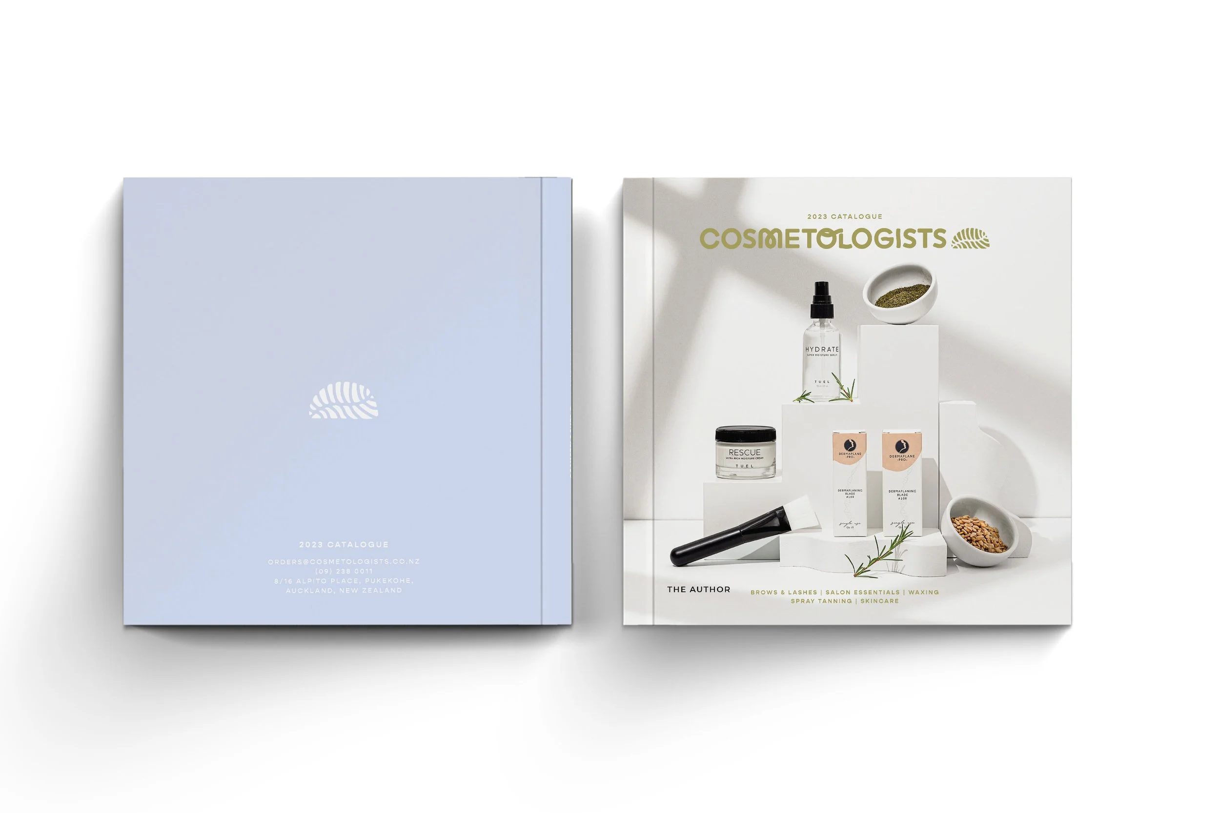
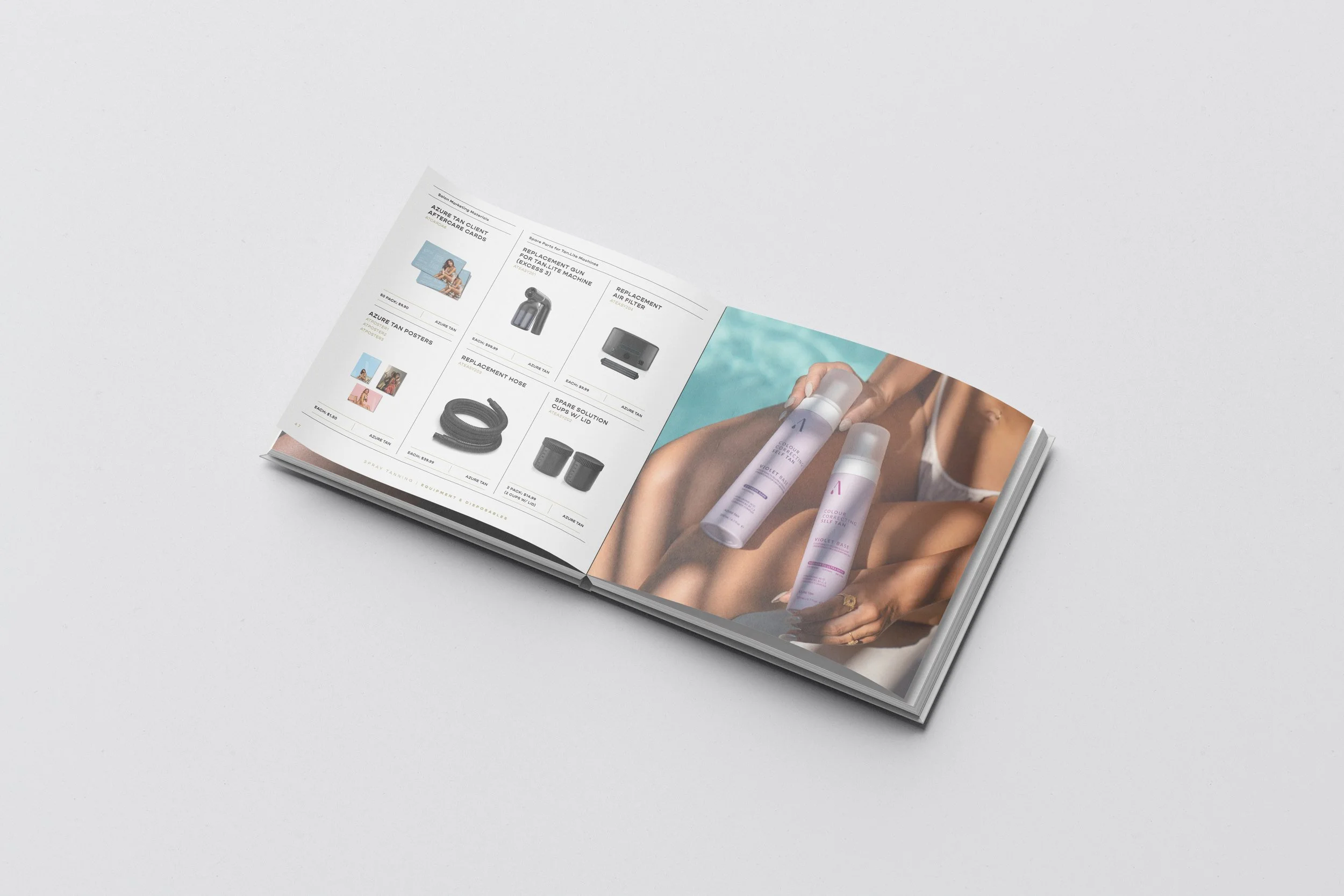
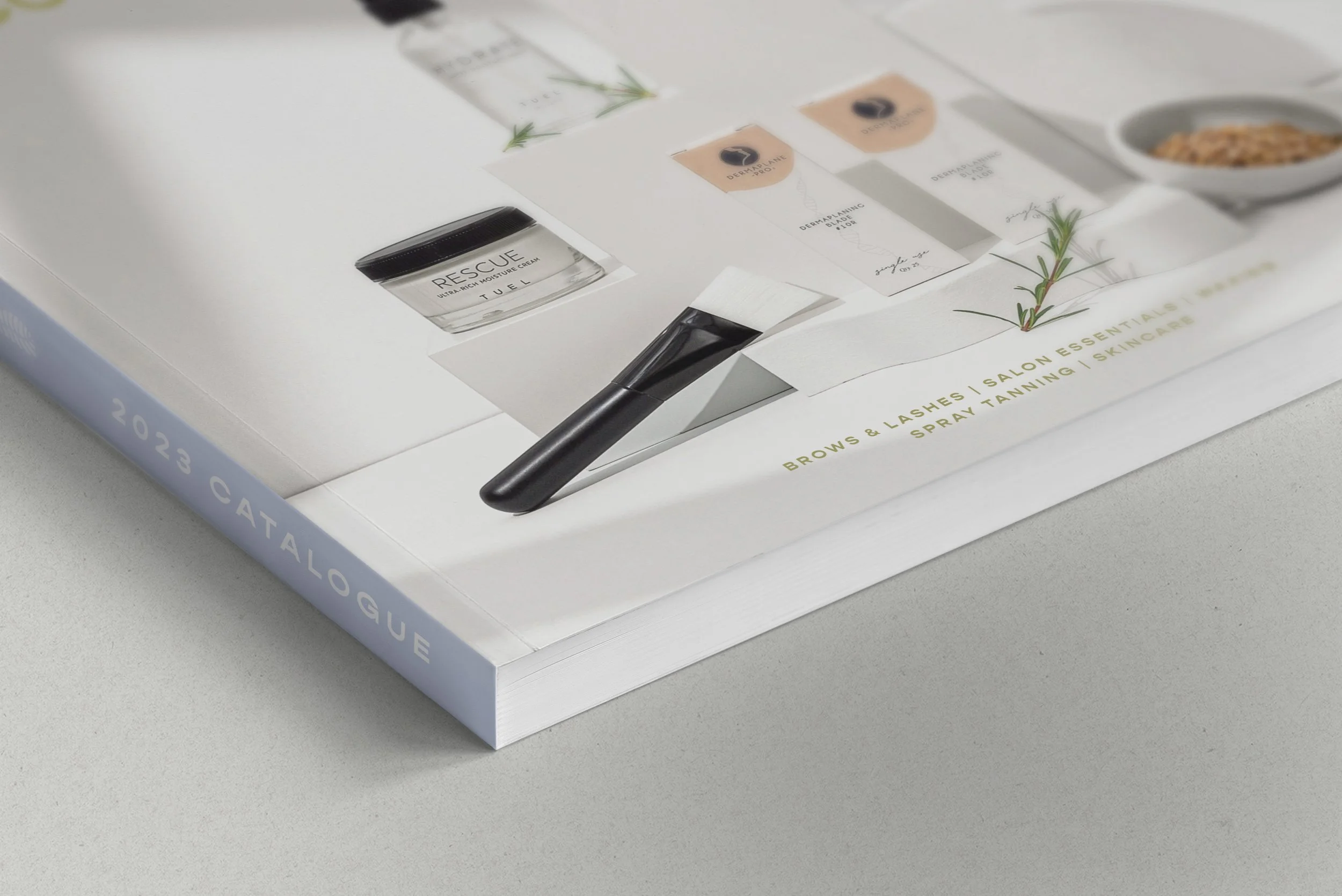
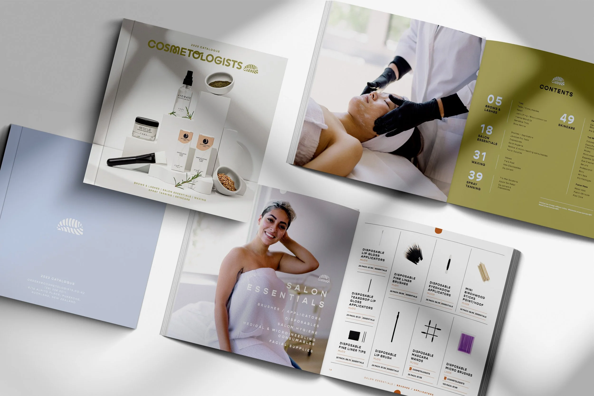
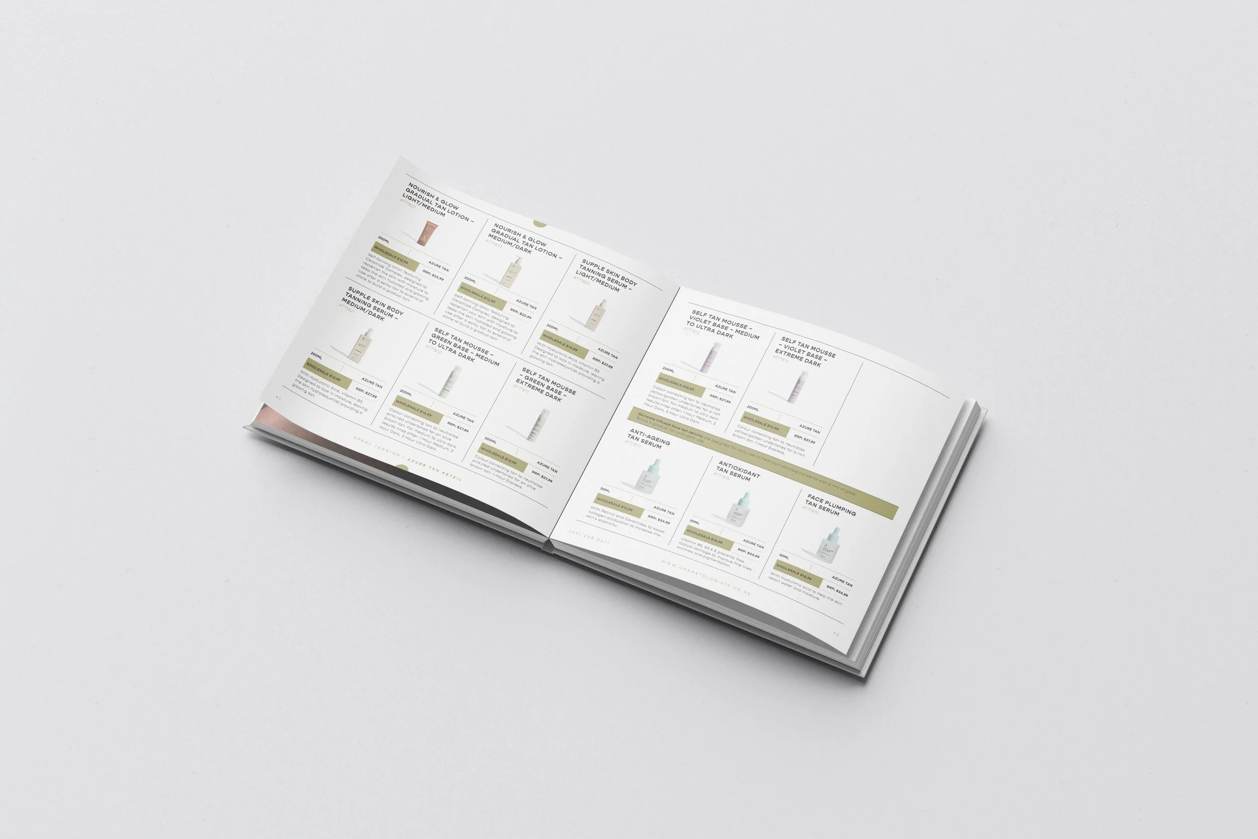
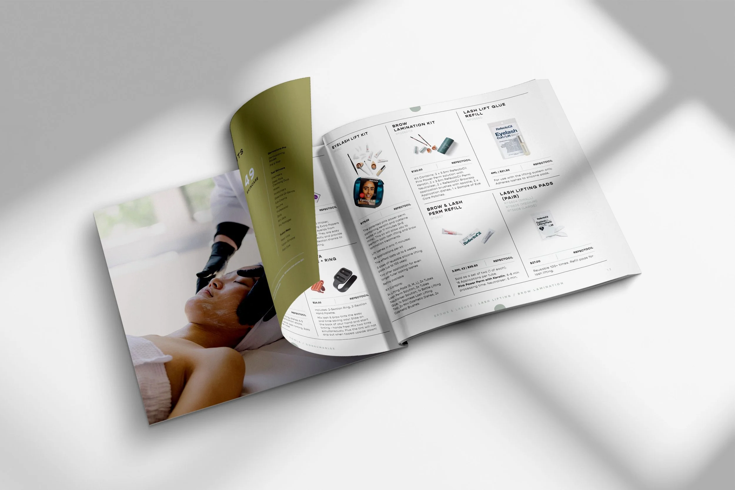
James and his team at cosmetologists sell professional beauty products - but only the good kind! They wanted a brand that showed them as the quirky but professional business that they are. They needed a look that showed a modern approach to beauty supplies - less fluff and shelf clutter, more results.
So we took a sanserif font, rounded it off, softened the feel, and added some quirky details. We then designed an icon that incorporated an abstract leaf that felt modern, different and gave a slight nod to the environment. Lastly, we added a fun but down-to-earth colour palette, and Voilà! This is Cosmetologists.
‘we sell some kick-ass brands’
“I've worked with a number of designers over the years and Holly makes them all look rather average in comparison. Her communication, execution and the overall process of working with her has been amazing! (Oh and so is the design(s)!)'"
-James Turner


